

CSS Anchor Positioning: tooltips, popovers and practical fallbacks
A tooltip, dropdown or settings panel needs more than a position near a button. Scrolling, zoom, long text, containing blocks and viewport edges can all change whether it fits. JavaScript positioning libraries have traditionally measured those conditions and updated coordinates.
CSS Anchor Positioning lets the browser position an element relative to another element and try alternative placements when it overflows. Implementation is advancing, but the specification remains a W3C Working Draft. This article explains the positioning model, its relationship with the Popover API, and the behavior you still need to design yourself.
Japanese original published: 2026-07-11
What anchor positioning solves
An anchor is an element used as a reference for another positioned element. A tooltip might use the button or input it describes. The positioned element can refer to the anchor’s position and size rather than relying only on a parent–child relationship.
- Help text and validation messages beside controls
- Dropdowns, popovers and settings panels opened by buttons
- Formatting toolbars beside an element placed at a text selection; a text Range is not itself an anchor element
- Supplementary cards associated with products or chart elements
A relatively positioned parent and an absolutely positioned child can already place content nearby. The difficult cases include elements separated in the DOM, popovers displayed in the top layer, and placements that must change near an edge. Anchor positioning makes the reference relationship explicit without requiring the anchor to be the positioned element’s parent.
What the JavaScript approach does
A JavaScript implementation can measure the button and popup with getBoundingClientRect(), compare their dimensions with available space, then assign coordinates. Scroll and resize events can require another calculation.
// button and popup have been obtained; measure popup while it is visible.
// Horizontal writing, with the viewport as the fixed containing block.
popup.style.position = "fixed";
const anchorRect = button.getBoundingClientRect();
const popupRect = popup.getBoundingClientRect();

const fitsAbove = anchorRect.top >= popupRect.height + 8;
popup.style.top = fitsAbove
  ? anchorRect.top - popupRect.height - 8 + "px"
  : anchorRect.bottom + 8 + "px";
This fragment illustrates only the vertical decision. It assumes a visible popup and a fixed containing block equal to the viewport. It omits horizontal placement, opening and closing, event handling and the case where neither side fits. A transformed ancestor can establish a different fixed containing block; viewport coordinates cannot then be assigned directly without conversion.
Positioning libraries also handle scroll containers, zoom, right-to-left text, transformed elements, arrows and collision rules. Anchor positioning can take over reference tracking and placement selection, but it does not automatically replace every library feature. Browser requirements, animation and integration with existing components may still justify a JavaScript implementation.
Three steps: name, associate and place
With an explicit anchor, first give the reference element a name, then associate the floating element with it, and finally choose a position.
Scroll horizontally if the table does not fit.
| Step | CSS | Purpose |
|---|---|---|
| Name the anchor | anchor-name | Assign a name such as --menu-button to the reference element. |
| Associate the element | position-anchor | Select the reference used by the positioned element. |
| Choose a placement | position-area or anchor() | Place it above, below or beside the anchor. |
An anchor name is a dashed identifier beginning with --, similar in spelling to a custom property name. Set the positioned element to position: absolute or position: fixed, and refer to the name with position-anchor.
Choose a region with position-area
position-area describes a three-by-three grid around the anchor. It can express a simple placement more directly than calculating separate top and left offsets.
.above  { position-area: block-start; }
.below  { position-area: block-end; }
.right  { position-area: inline-end; }
.corner { position-area: block-end inline-end; }
The containing block is the reference region used to lay out a positioned element. The anchor’s edges and the containing block’s edges define the regions selected by position-area. Describing “above” or “below and toward inline-end” makes the intent easier to read. Use anchor() when you need finer offsets or edges from different anchors.
Read positions and dimensions with anchor functions
anchor() supplies an anchor edge or center position for inset properties such as top and left, including within calc(). anchor-size() can supply an anchor dimension.
.menu {
  position: fixed;
  position-anchor: --menu-button;
  top: calc(anchor(bottom) + 8px);
  left: anchor(left);
  min-width: anchor-size(width);
}
This CSS places the menu’s top eight pixels below the button’s bottom, aligns their left edges, and sets the menu’s minimum width to the button’s width. The reference button must have anchor-name: --menu-button. These are placement rules, not a complete menu component.
For ordinary placements, start with position-area; use anchor functions where the additional control is helpful rather than turning every placement into an equation.
Try another placement when content overflows
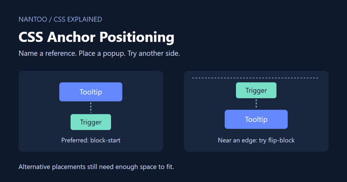
A tooltip above a button can be clipped when the button is near the top edge. A fallback can try the opposite side.
.tooltip {
  position: fixed;
  position-anchor: --help;
  position-area: block-start;
  position-try-fallbacks: flip-block;
}
flip-block is a predefined tactic that reverses the placement along the block axis—normally above and below in horizontal writing. Comma-separated alternatives can be tried in order, and @position-try can define custom options including placement and width. The position-try shorthand combines fallback options with their ordering policy.
There is no guarantee that any candidate will fit. MDN’s example describes returning to the initial placement when all alternatives fail. The current CSSWG draft instead retains the current styles, which may already come from an earlier fallback. Do not rely on an unconditional return to the first placement; test scrolling and resizing in your target browsers. Set sensible size limits, edge spacing and scrolling behavior as well; fallback placement does not make arbitrarily large content fit.
Combine positioning with the Popover API
The Popover API controls showing, hiding and presentation in the top layer. Auto popovers—the default—and hint popovers support light dismissal, such as clicking outside. Anchor positioning controls where that popover appears relative to its trigger.
<button type="button" popovertarget="account-menu">Account</button>
<div id="account-menu" popover>...</div>

#account-menu {
  position-area: block-end;
  position-try-fallbacks: flip-block;
  margin-block-start: 8px;
}
A relationship established through popovertarget can also provide an implicit anchor. In that configuration, the explicit anchor-name and position-anchor declarations can be omitted. Keep type="button" on the trigger when it might appear in a form.
A popover is not automatically a menu or tooltip with the correct semantics. Check visibility, placement, HTML meaning and keyboard interaction separately. The ellipsis above stands for content you must supply; it is not a complete account menu.
Accessibility is a separate part of the component
Anchor positioning itself does not create or change accessibility relationships. A visually correct placement alone does not tell assistive technology which control the content describes.
CSS can replace measurements and placement decisions; it does not necessarily implement the whole interaction.
- Can keyboard users reach the same help that mouse users receive?
- For a menu, how do arrow keys, Escape and focus movement work?
- Where should focus return after a popover closes?
- Is the control–content relationship exposed with appropriate semantics?
- Can users still read long translations or enlarged text?
The Popover API provides useful default behavior, but adding popover does not satisfy every menu, dialog or tooltip requirement. Choose suitable HTML and any necessary ARIA, then design and test focus and keyboard behavior for that component.
Scope names in repeated components
Repeated cards can each contain a trigger and popup using the same anchor name. The current lookup rules prefer the nearest eligible matching ancestor; otherwise they select the last eligible matching element in tree order. Eligibility and scope matter: this is not simply a search for any element with the same name.
anchor-scope restricts named-anchor lookup to a subtree so a reusable component can keep its own reference.
.product-card {
  anchor-scope: --actions;
}

.product-card__button {
  anchor-name: --actions;
}

.product-card__menu {
  position: absolute;
  position-anchor: --actions;
  position-area: block-end;
}
Without an appropriate scope, multiple popups can point to the same button. Decide whether to use an implicit popover relationship, unique names or anchor-scope. Test repeated siblings and eligible ancestor anchors in target browsers: draft lookup rules and implementations can differ.
Compatibility and a practical fallback
As checked on 11 November 2026, CSS Anchor Positioning Level 1 remains a W3C Working Draft. It may change, be replaced or be withdrawn. MDN lists anchor-name as Baseline 2026, Newly available, while warning that older browsers and parts of the feature have different support levels.
Neither the calendar year nor the draft label is enough to decide whether to use it. Check the properties you need against the browsers your readers use.
The following fallback is for horizontal writing (writing-mode: horizontal-tb). The tooltip and trigger share a .trigger-wrap. Basic absolute positioning works without anchor positioning; the feature query enables the enhanced rules only when all four declarations are recognized.
.trigger-wrap {
  position: relative;
  width: fit-content;
}

.tooltip {
  position: absolute;
  bottom: calc(100% + 8px);
  left: 50%;
  transform: translateX(-50%);
}

@supports (anchor-name: --trigger) and
          (position-anchor: --trigger) and
          (position-area: block-start) and
          (position-try-fallbacks: flip-block) {
  .trigger { anchor-name: --trigger; }
  .tooltip {
    position: fixed;
    position-anchor: --trigger;
    position-area: block-start;
    position-try-fallbacks: flip-block;
    inset: auto;
    margin-block-end: 8px;
    transform: none;
  }
}
Physical left and translateX() keep the horizontal fallback centered in both LTR and RTL text. Vertical writing needs a separate design. @supports checks declaration support, not rendering correctness; check Popover API support separately too.
Fallbacks need not reproduce every visual detail. Keep essential information in ordinary document content, use a simpler fixed-side tooltip, or retain a proven positioning library for more demanding interfaces. The important requirement is to preserve information and essential actions.
A checklist before adopting it
Test real content and interaction conditions, not just an attractive demonstration.
- Choose the reference: identify the anchor and whether its association is implicit or explicit.
- Choose the initial placement: select a natural position with the appropriate writing-mode rules.
- Exercise difficult conditions: test all four edges, narrow screens, 200% zoom, long text and RTL layouts.
- Limit the alternatives: keep the order meaningful for the interface.
- Move the arrow too: update any arrow when the placement flips.
- Check interaction: test keyboard access, focus, announcements and dismissal.
- Check the fallback: preserve information and core actions when a feature is unavailable.
An arrow that still points in the old direction after a flip can misidentify the associated control. The visual relationship to the anchor is part of the fallback state and should be tested with it.
Summary
Anchor positioning changes who calculates the placement, rather than replacing the concepts of tooltips or popovers.
anchor-nameandposition-anchorestablish an explicit reference.position-areaselects a region around that reference.anchor()andanchor-size()expose edges and dimensions.- The
position-tryfamily supplies alternative placements. - The Popover API can provide visibility behavior and an implicit trigger relationship.
- Draft status, browser compatibility and useful fallbacks still matter.
Moving placement calculations into CSS can leave JavaScript focused on state, data and interaction. It does not automatically solve accessibility or unsupported environments. Start with supplementary UI that does not block essential tasks, and verify it under your actual content and browser conditions.
References and sources
- drafts.csswg.org: CSS Anchor Positioning Module Level 1 ↗
- MDN Web Docs: CSS anchor positioning - CSS ↗
- MDN Web Docs: Using CSS anchor positioning - CSS ↗
- MDN Web Docs: Fallback options and conditional hiding for overflow - CSS ↗
- MDN Web Docs: anchor-name CSS property - CSS ↗
- MDN Web Docs: anchor-scope CSS property - CSS ↗
- MDN Web Docs: Popover API - Web APIs ↗
- WHATWG: HTML Standard ↗
Editorial note
This article was prepared with AI assistance and reviewed by an editor before publication. It may still contain factual errors, interpretation mistakes, or outdated information. Check the cited primary sources or official documentation before making an important decision.