

CSS color-mix() and OKLCH: Build Brand Color Variants with Tested Fallbacks
A brand color is only the start of a UI palette. Hover states, active states, borders, and backgrounds all need related colors. CSS color-mix() and OKLCH can express those relationships without manually maintaining every variant.
Generating a color is separate from proving that a control is readable or that its state is clear. This guide uses two-color mixes and CSS custom properties, with explicit fallbacks and checks for both light and dark themes.
Japanese original published: 2026-04-23
sRGB, HSL, and OKLCH describe different things
sRGB is a widely used RGB color space on the web. HSL is a way to manipulate RGB colors through hue, saturation, and lightness, but equal HSL lightness does not imply equal perceived brightness.
For example, hsl(60 100% 50%) and hsl(240 100% 50%) have the same HSL lightness and very different relative luminance. HSL's lightness comes from the largest and smallest RGB components; it is not a perceptually uniform measure.
CIELAB and Oklab aim to make perceptual differences easier to work with. Björn Ottosson published Oklab in 2020; OKLCH is its polar-coordinate representation. Perceptual uniformity is an approximation, not perfect agreement for all colors and viewing conditions.
Read the L, C, and H components
OKLCH expresses Oklab through three components:
- L, lightness: commonly written from 0 to 1 or as a percentage.
- C, chroma: zero is achromatic. The often-used value 0.4 is not a specification maximum; the displayable range depends on lightness, hue, and target gamut.
- H, hue: an angle around the hue circle, often expressed in degrees.
oklch(62.3% 0.214 259.815)
oklch(0.623 0.214 259.815)
These are two notations for the same color, used for Tailwind v4's blue-500. Oklab aims to improve perceptual behavior, including in blue regions, and can represent colors beyond sRGB. That does not mean every display can reproduce every OKLCH value.
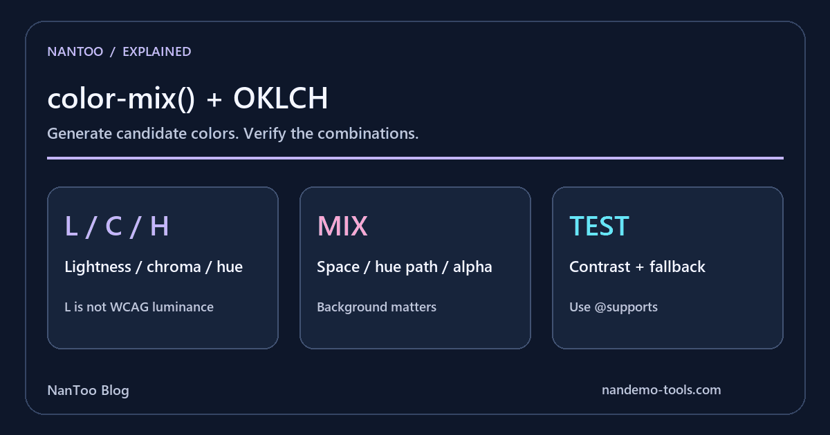
Keeping L consistent can help coordinate colors with different hues. However, OKLCH L is not WCAG relative luminance. Contrast against the actual background still needs a separate calculation.
Choose the mixing space and hue path
The examples here specify a color space and two colors. Omitted percentages, percentage normalization, and alpha all affect the result.
color-mix(in srgb, red 50%, blue)
color-mix(in oklch, #2563eb 80%, white)
color-mix(in oklch, #2563eb, black 30%)
color-mix(in oklch longer hue, red, blue)
The first three examples mix 50:50, 80:20, and 70:30 respectively. In polar color spaces, hue interpolation can follow different paths, such as shorter hue and longer hue. OKLCH does not guarantee that every mix matches the designer's intention or avoids every muted intermediate color.
Mixing with transparency changes alpha. The visible result then depends on compositing with the background. Out-of-gamut values may also be mapped when displayed, so inspect the actual output rather than assuming the notation alone guarantees a particular appearance.
Generate variants from a brand token
A custom property can provide the input for several variants:
:root {
  --brand: #2563eb;
  --brand-hover: color-mix(in oklch, var(--brand), white 15%);
  --brand-active: color-mix(in oklch, var(--brand), black 15%);
  --brand-disabled: color-mix(in oklch, var(--brand), transparent 60%);
  --brand-border: color-mix(in oklch, var(--brand), white 70%);
  --brand-bg: color-mix(in oklch, var(--brand), white 92%);
  --brand-focus: color-mix(in oklch, var(--brand), transparent 70%);
}
.button {
  background: var(--brand);
  border: 1px solid var(--brand-border);
}
.button:hover { background: var(--brand-hover); }
.button:active { background: var(--brand-active); }
.button:disabled { background: var(--brand-disabled); }
Changing --brand updates the relationships. This is a color-generation example, not an accessibility-tested finished palette. If the button has white text, lightening its hover background may reduce the text's contrast.
Check focus indicators and borders against their actual adjacent colors too. Inactive controls have WCAG exceptions, but their state should still be understandable. A generated token is a candidate to test, not a pass result.
Separate feature support from fallback behavior
MDN compatibility data checked on September 5, 2026 lists basic oklch() support from Chrome/Edge 111, Firefox 113, and Safari 15.4. Two-color color-mix() is listed from Chrome/Edge 111, Firefox 113, and Safari 16.2. Relative colors and newer extensions require separate checks. These version numbers are not a measured audience-support percentage.
Custom properties can retain token sequences containing a function that is not supported as a color. Repeating a variable declaration with a static value first does not necessarily restore that earlier value when the later value fails at computed-value time. Use feature detection around the update:
:root { --brand-hover: #3b7ced; }
@supports (color: color-mix(in oklch, red, blue)) {
  :root { --brand-hover: color-mix(in oklch, #2563eb, white 15%); }
}
.button:hover { background-color: var(--brand-hover); }
The static value is a fallback color, not a promise of an exact match to the computed mix. Test both variants with their text and background. Passing a support query also does not prove the absence of browser-specific rendering differences.
Tailwind's color definitions still need context
Tailwind CSS v4's official palette uses OKLCH, including --color-blue-500: oklch(62.3% 0.214 259.815). It is inaccurate to characterize the entire v3 default palette as HSL-based.
Built-in colors still need to be evaluated in their actual foreground, background, and state combinations. Using OKLCH does not by itself guarantee wide-gamut output or accessibility.
A practical color-design workflow
- Define the brand color in OKLCH or convert a known input color.
- Express candidate variants with
color-mix(). - Use consistent lightness where useful, while remembering that L is not a contrast ratio.
- For regular text at WCAG AA, check the 4.5:1 requirement where applicable and account for the criterion's exceptions.
- Choose base colors for both themes and verify all resulting pairs.
- Define static fallback values, then update custom properties inside
@supports. - Name tokens by their role, such as
--text-mutedor--brand-hover, so their purpose is reviewable.
Color generation and validation belong in the same workflow. Neither a modern syntax nor a popular palette substitutes for checking the rendered interface.
Summary
- OKLCH describes lightness, chroma, and hue with an approximate perceptual model.
- color-mix() shares formulas for variants; it does not guarantee a contrast pass.
- Check percentages, hue paths, alpha, backgrounds, and gamut separately.
- Use @supports to separate custom-property fallbacks from computed colors.
- Distinguish basic syntax from newer features and verify both light and dark themes.
References and sources
- W3C — CSS Color Module Level 5 (Working Draft) ↗
- Björn Ottosson — A perceptual color space for image processing ↗
- W3C — CSS Color Module Level 4 ↗
- ISO 11664-4:2019 — CIE 1976 L*a*b* colour space ↗
- Tailwind CSS — Colors ↗
- MDN — color-mix() ↗
- W3C — CSS Custom Properties Level 1 ↗
- MDN Browser Compatibility Data — CSS color ↗
Editorial note
This article was prepared with AI assistance and reviewed by an editor before publication. It may still contain factual errors, interpretation mistakes, or outdated information. Check the cited primary sources or official documentation before making an important decision.