

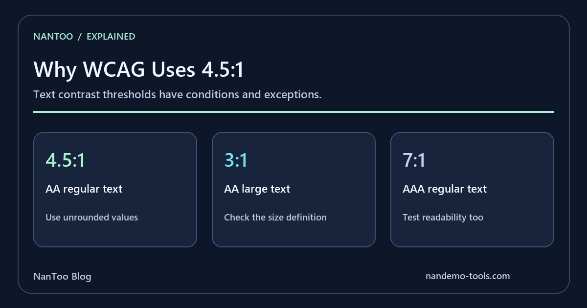
Why WCAG Uses a 4.5:1 Contrast Ratio: The Formula and Its Limits
The 4.5:1 ratio is familiar to anyone checking text contrast for WCAG. Understanding what it measures is more useful than memorizing one number: the formula, text size, conformance level, and exceptions all affect the result.
This guide follows WCAG 2.2 and its supporting explanations. It separates the current conformance rules from perceptual evaluation and work on future guidelines.
Japanese original published: 2026-04-18
What a contrast ratio measures
WCAG defines the ratio using the lighter and darker colors' relative luminance:
contrast ratio = (L1 + 0.05) / (L2 + 0.05)
L1 = lighter relative luminance
L2 = darker relative luminance
The result ranges from 1:1 for identical colors to 21:1 for black and white. The 0.05 term accounts for a viewing-flare contribution in the definition's underlying model; it is not an arbitrary tolerance that can be adjusted to make a design pass.
A ratio is dimensionless. It compares relative luminance rather than directly measuring the physical brightness of the reader's screen.
Linearize sRGB before calculating luminance
For sRGB, calculate relative luminance from linearized components:
L = 0.2126 * R + 0.7152 * G + 0.0722 * B

c = component8bit / 255
linear = c <= 0.04045 ? c / 12.92 : ((c + 0.055) / 1.055) ** 2.4
Apply the conversion separately to red, green, and blue, then combine the linear values. Averaging the original R, G, and B numbers does not implement this formula. The weights correspond to the sRGB/BT.709 primaries and are not equal across components.
The current boundary is 0.04045. The older WCAG definition used 0.03928 before May 2021. No 8-bit integer divided by 255 falls between those boundaries, so the branch choice is unchanged for that input set. Use the current definition when explaining or implementing the formula, especially with continuous inputs.
In mathematical notation, a caret can mean exponentiation; JavaScript uses **. Do not paste a mathematical ^ into JavaScript and expect a power operation.
Where the 4.5:1 threshold comes from
W3C's Understanding document describes a 3:1 starting point from earlier standards and an approximately 1.5-fold contrast-sensitivity loss associated with 20/40 visual acuity. This gives the explanatory calculation 3 × 1.5 = 4.5.
20/40 is Snellen notation, equivalent to decimal visual acuity 0.5. The notation alone does not indicate whether the measurement was corrected. W3C also discusses the rationale for 7:1 using findings associated with 20/80 acuity.
This explains a standards threshold; it does not predict every individual's reading experience. Visual acuity and contrast sensitivity are different measures. The supporting Understanding material is informative, rather than the normative success criterion itself.
The ratio should not be attributed to a single inventor or presented as a direct calculation from the Weber–Fechner law. Those claims are not needed to explain the documented rationale.
AA, AAA, and the conditions that change the threshold
Scroll horizontally if the table does not fit.
| Level | Regular text | Large-scale text |
|---|---|---|
| AA | 4.5:1 | 3:1 |
| AAA | 7:1 | 4.5:1 |
The large-text definition uses 18pt, or 14pt bold, with equivalent sizes considered for CJK fonts. In CSS units, 18pt is 24px and 14pt is approximately 18.67px.
Exceptions include specified incidental content, inactive controls, and logotypes. Non-text contrast under 1.4.11 has its own scope: visual information needed to identify controls and states, and parts of graphics needed to understand their content, are evaluated against adjacent colors. It is not a blanket demand that every decorative border reach 3:1.
Higher contrast can be useful, but a level label does not guarantee comfortable reading for everyone. Check the exact criterion and its exceptions before reporting a pass or failure.
APCA and WCAG 3 do not replace the current calculation
APCA, the Accessible Perceptual Contrast Algorithm, evaluates text contrast with attention to factors such as text size, weight, and polarity. Its scale is different from the WCAG 2.x ratio; a value on one scale cannot be substituted directly for a 4.5:1 requirement.
When checked on September 5, 2026, WCAG 3 remained a Working Draft. Do not describe APCA as a finalized replacement for WCAG 2.2 conformance. If the assessment is against WCAG 2.2, use its criteria; additional perceptual evaluation can complement that work.
Thin fonts, anti-aliasing, dark-mode combinations, and viewing conditions can influence readability. A numerical pass is useful evidence about a defined criterion, not a promise that every person will find the text easy to read.
Turn the calculation into a design check
- Check foreground/background pairs while designing, using a contrast tool or development tools.
- Keep semantic color tokens for text, backgrounds, links, and states so both light and dark themes can be checked.
- Evaluate focus separately: visible focus, author-defined state contrast, and the AAA focus-appearance requirements have different scopes.
- Include people with different visual needs in usability testing where possible.
Use the unrounded ratio for threshold decisions. 4.499:1 does not pass a 4.5:1 threshold, even if a short display rounds it to 4.5.
WCAG is a technical standard. This article does not determine the legal requirements or certification status of a particular service or jurisdiction.
Summary
- Linearize sRGB and calculate (L1 + 0.05) / (L2 + 0.05).
- Use the current 0.04045 boundary and make decisions before rounding.
- Regular text uses 4.5:1 at AA and 7:1 at AAA; large text and non-text content have their own conditions.
- The documented rationale explains a threshold without guaranteeing individual readability.
- Keep APCA and WCAG 3 discussions separate from a WCAG 2.2 conformance claim.
References and sources
Editorial note
This article was prepared with AI assistance and reviewed by an editor before publication. It may still contain factual errors, interpretation mistakes, or outdated information. Check the cited primary sources or official documentation before making an important decision.