

CSS clip-path pitfalls: shadows, animation, layout and a past Safari bug
CSS clip-path changes which parts of an element are visible. A missing shadow or an unexpectedly large layout box is not necessarily a browser bug. This guide separates behavior defined by CSS from a historical WebKit issue involving SVG references, then shows how to test each case.
Japanese original published: 2026-04-17
Start with a basic shape
Use clip-path to clip an element to a polygon, circle, ellipse or other supported shape, including a path.
.hexagon {
  clip-path: polygon(
    25% 0%, 75% 0%, 100% 50%,
    75% 100%, 25% 100%, 0% 50%
  );
}
Basic clipping is widely available in modern browsers, but support must be checked for the particular syntax you use. Older Safari releases required the -webkit-clip-path prefix. If those releases are in your support range, put the compatible declaration first and the standard declaration second. Check the compatibility data and test the actual target devices.
.hexagon {
  -webkit-clip-path: polygon(25% 0%, 75% 0%, 100% 50%, 75% 100%, 25% 100%, 0% 50%);
          clip-path: polygon(25% 0%, 75% 0%, 100% 50%, 75% 100%, 25% 100%, 0% 50%);
}
A historical WebKit bug: SVG references and stacking contexts
WebKit Bug 233553 reported an <img> disappearing when clip-path: url(#shape) was combined with a property that created a stacking context, such as a transform. The referenced SVG used clipPathUnits="objectBoundingBox".
A fix landed in WebKit on 5 November 2024, and the issue is marked RESOLVED FIXED. The landing date alone does not establish the first shipping Safari version containing the fix. This is a historical report, not evidence that current Safari generally fails to combine clipping and transforms. Nor does it show that every combination of polygon() and a transform is unreliable.
/* CSS fragment for isolating the historical conditions.
   An image and a separate SVG #shape definition are required. */
.masked-image {
  clip-path: url(#shape);
  transform: translate3d(0, 0, 0); /* Example stacking-context trigger */
}
On the target Safari version, test the SVG reference alone, the stacking-context trigger alone, and then both together. If the problem occurs, remove unnecessary compositing-related declarations or try a basic shape such as polygon() when it can express the same outline. Verify the result on the target device. Adding compositing triggers indiscriminately is not a reliable fix and can recreate the conditions of the historical issue.
Put the shadow on a wrapper, not on the clipped element
A box-shadow outside the clipping region is clipped too. This is specified behavior, not a Safari-only defect. An ordinary outer box shadow on an opaque clipped element therefore does not produce an outer shadow following its new outline.
/* The part of the shadow outside the clipping region is removed. */
.badge {
  clip-path: polygon(25% 0%, 75% 0%, 100% 50%, 75% 100%, 25% 100%, 0% 50%);
  box-shadow: 0 4px 12px rgba(0,0,0,.2);
}
CSS Masking applies filters before clipping. Putting filter: drop-shadow() on that same element still subjects the shadow to its clip. Instead, put the filter on a wrapper and clip its child. In the following example, use the first part as HTML and the part starting with .badge-shadow as CSS.
<div class="badge-shadow">
  <div class="badge-shape">Badge</div>
</div>

.badge-shadow {
  display: inline-block;
  filter: drop-shadow(0 4px 12px rgba(0,0,0,.25));
}
.badge-shape {
  width: 160px;
  height: 100px;
  display: grid;
  place-items: center;
  background: #2563eb;
  color: white;
  clip-path: polygon(25% 0%, 75% 0%, 100% 50%, 75% 100%, 25% 100%, 0% 50%);
}
Keep the wrapper's own background transparent so that the child's shape supplies the shadow outline. An ancestor with overflow: hidden can still cut off the result. Filter cost also depends on the affected area and how many filtered elements are drawn; measure on target devices when using this pattern extensively.
Match polygon vertices, fill rules and reference boxes
Polygons with different vertex counts cannot interpolate their coordinates continuously. CSS keyframes and Web Animations can switch discretely between such values; a normal CSS transition does not start for a discrete change by default. For a linear animation with two keyframes, the discrete switch occurs halfway through the interval. With a default transition, the new value can instead take effect immediately.
/* Not continuously interpolable: four vertices to six */
.el { clip-path: polygon(0 0, 100% 0, 100% 100%, 0 100%); }
.el:hover { clip-path: polygon(25% 0, 75% 0, 100% 50%, 75% 100%, 25% 100%, 0 50%); }
Give both endpoints the same number of vertices. Repeating a coordinate lets an extra vertex start at the same position as another vertex.
/* Six vertices at both endpoints */
.el {
  clip-path: polygon(0 0, 100% 0, 100% 0, 100% 100%, 0 100%, 0 100%);
}
.el:hover {
  clip-path: polygon(25% 0, 75% 0, 100% 50%, 75% 100%, 25% 100%, 0 50%);
}
CSS Shapes also requires the same reference box and fill-rule for this polygon interpolation. Both values above use the defaults: border-box and nonzero. These hover rules define shapes, not animation timing. Add a declaration such as transition: clip-path 250ms linear to animate the change, and accommodate reduced-motion preferences, for example by disabling that transition.
Separate ancestor overflow from the child's clip
A parent's overflow: hidden and a child's clip-path impose separate clipping constraints. Their combined effect can look like a broken shape if you inspect only the child.
Temporarily switch the parent's overflow to visible to inspect the child's shape on its own. Then restore the required parent dimensions and overflow behavior. Adding position or isolation without identifying the clipping boundary does not explain the problem.
.parent {
  position: relative;
  overflow: hidden;
}
.child {
  clip-path: polygon(25% 0%, 75% 0%, 100% 50%, 75% 100%, 25% 100%, 0% 50%);
}
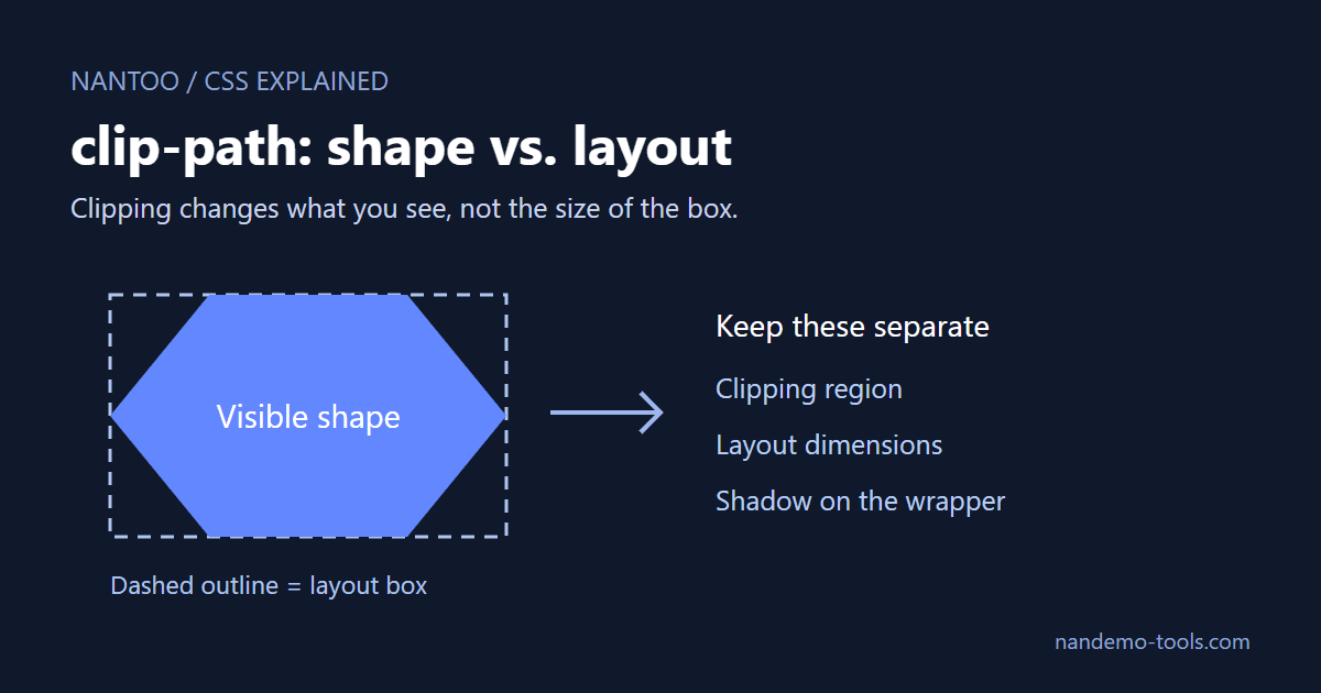
Clipping does not shrink the layout box
clip-path affects rendering, not the element's underlying geometry or intrinsic size calculations. This remains true inside Grid and Flexbox. The invisible area still belongs to the box used for layout, so a small visible icon can appear to have unexplained space around it.
Set the box dimensions you actually need. aspect-ratio can help derive a dimension when an axis is automatic, but a ratio alone does not specify a size. Account for constraints imposed by the parent, including flex shrinking.
.icon {
  width: 32px;
  height: 32px;
  clip-path: polygon(25% 0%, 75% 0%, 100% 50%, 75% 100%, 25% 100%, 0% 50%);
}
A practical debugging sequence
- Inspect Safari directly when Safari is the target. A successful Chrome test cannot establish Safari behavior.
- Stop animations and transitions, then remove transforms separately. Setting
transform: nonedoes not stop an animation ofclip-path. Pause motion in developer tools and isolate each declaration. - Disable clipping temporarily. Use
clip-path: noneto see the underlying layout box before restoring the shape. - Check the specific feature and its rendering. Polygon functions, path functions and SVG references are not interchangeable compatibility tests.
CSS.supports()checks support for a declaration; it does not prove that the result renders without bugs.
Summary
- For older Safari targets that need it, place the prefixed declaration before the standard declaration.
- WebKit Bug 233553 is a fixed historical issue. Test SVG references and stacking-context triggers separately on the actual target version.
- For an outer shape-following shadow, filter the wrapper and clip the child.
- For continuous polygon interpolation, match vertex counts, fill rules and reference boxes.
- Inspect ancestor overflow independently from the child's clipping region.
- Size the layout box explicitly when appropriate; clipping itself does not shrink it.
References and sources
- W3C: CSS Box Sizing Module Level 4 ↗
- W3C: CSS Transitions Module Level 2 ↗
- W3C: Web Animations ↗
- MDN Web Docs: clip-path CSS property - CSS ↗
- W3C: CSS Masking Module Level 1 ↗
- W3C: CSS Shapes Module Level 1 ↗
- bugs.webkit.org: 233553 – Combining CSS clip-path with any property that creates a new stacking context makes img element disappear ↗
Editorial note
This article was prepared with AI assistance and reviewed by an editor before publication. It may still contain factual errors, interpretation mistakes, or outdated information. Check the cited primary sources or official documentation before making an important decision.